What's a handmade data object anyways?
Collaboration with &
This project was a collaboration with some of my favourite colleagues in the Starschema data visualization team. We wrote about its story in more detail for the Nightingale, so this is a shortened version, with an additional section on the digital prototype sprinkled in.
Answering the challenge
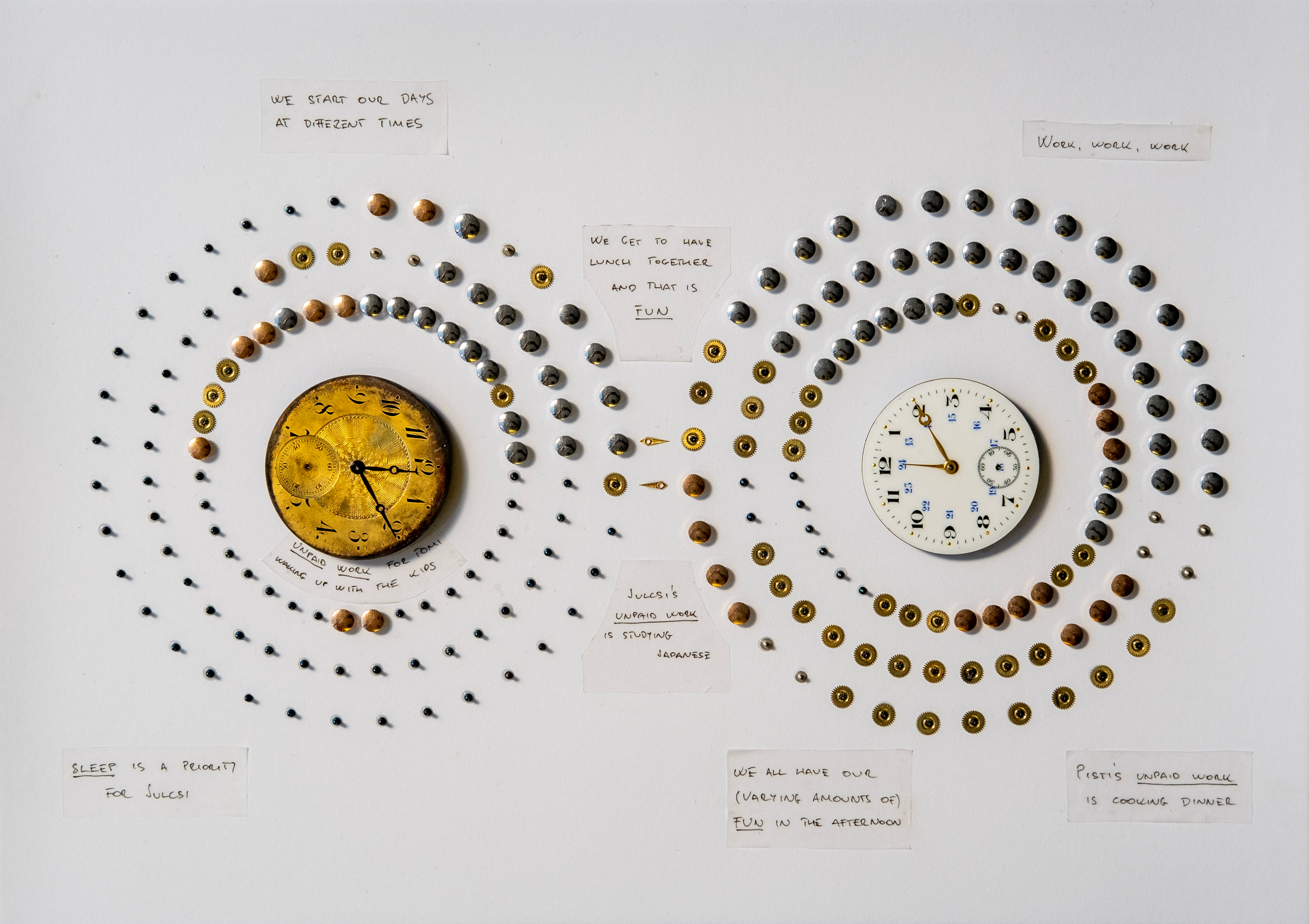
The first edition of the Nightingale print magazine for the data visualization field posted the Dear Nightingale challenge, calling for unique analog approaches to data visualization. We chose to visualize our daily routines using old watch parts.
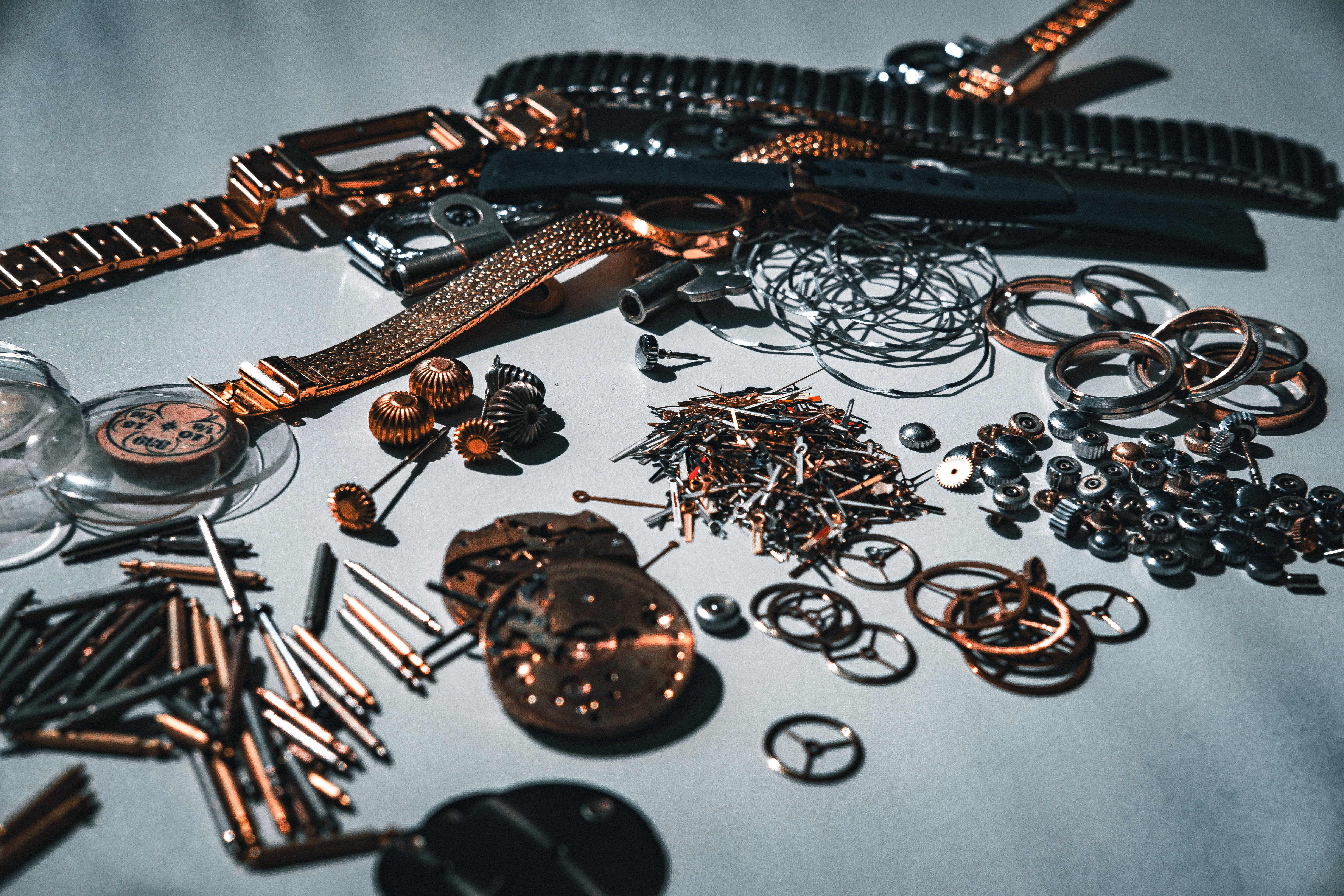
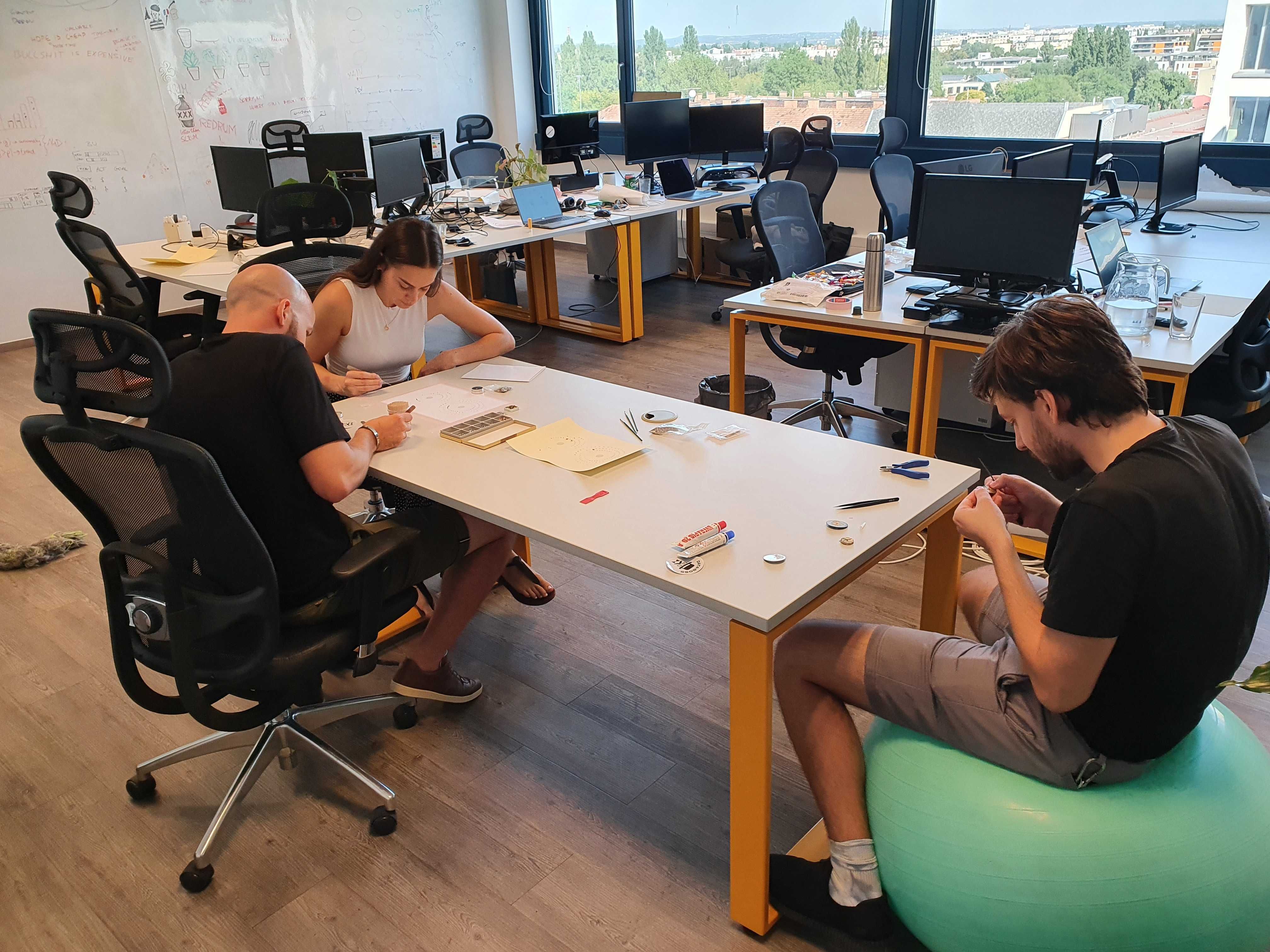
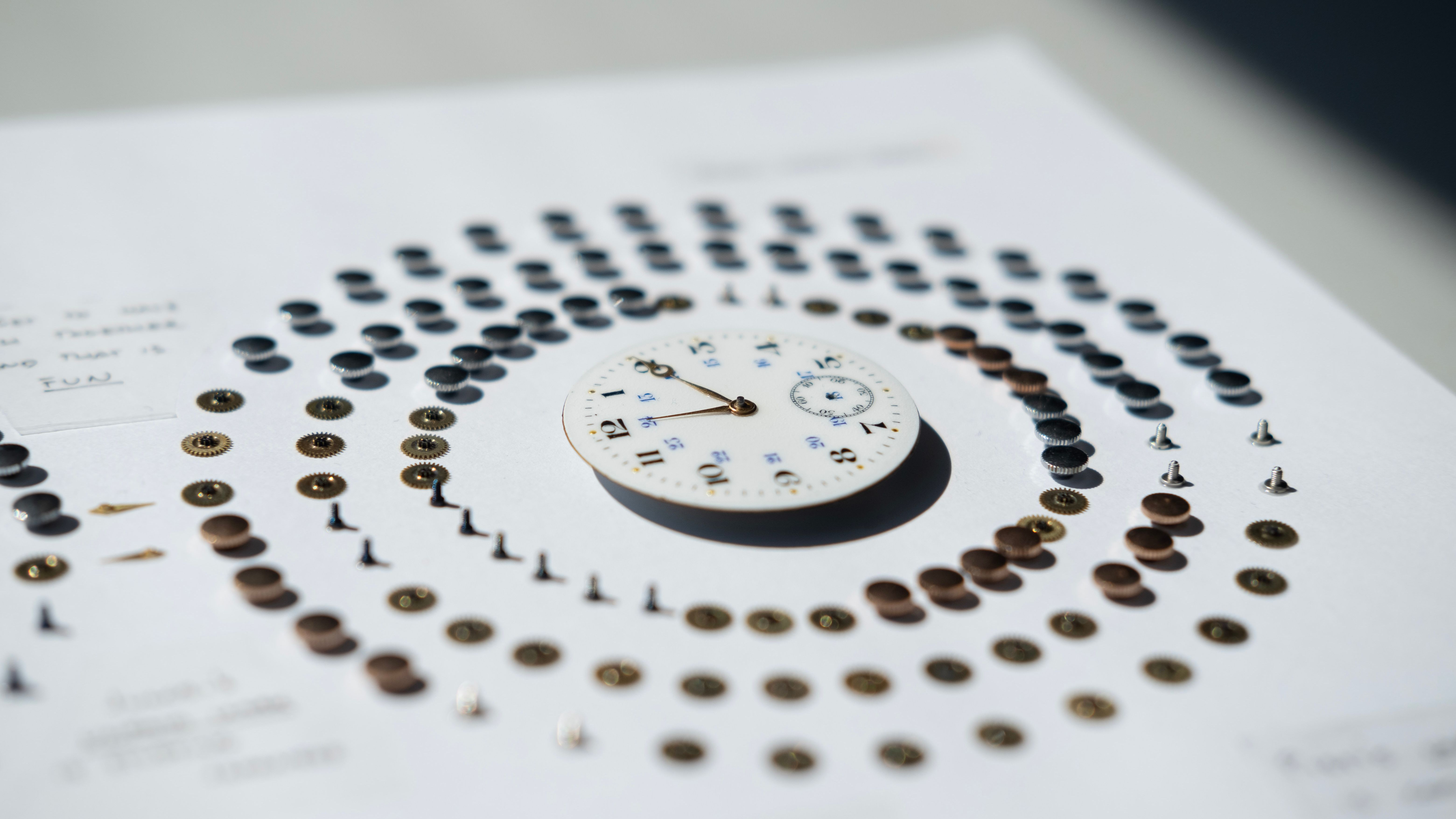
After a rough accounting for how we spend our time, we divided the day's activities into categories of sleep, commute, paid work, unpaid work and fun. We then used the watch parts we were gifted by Julcsi's father, to map them out on paper. We chose a circular format, with different types of pieces representing the specific categories and then simply glued the pieces onto the paper.
The digital prototype
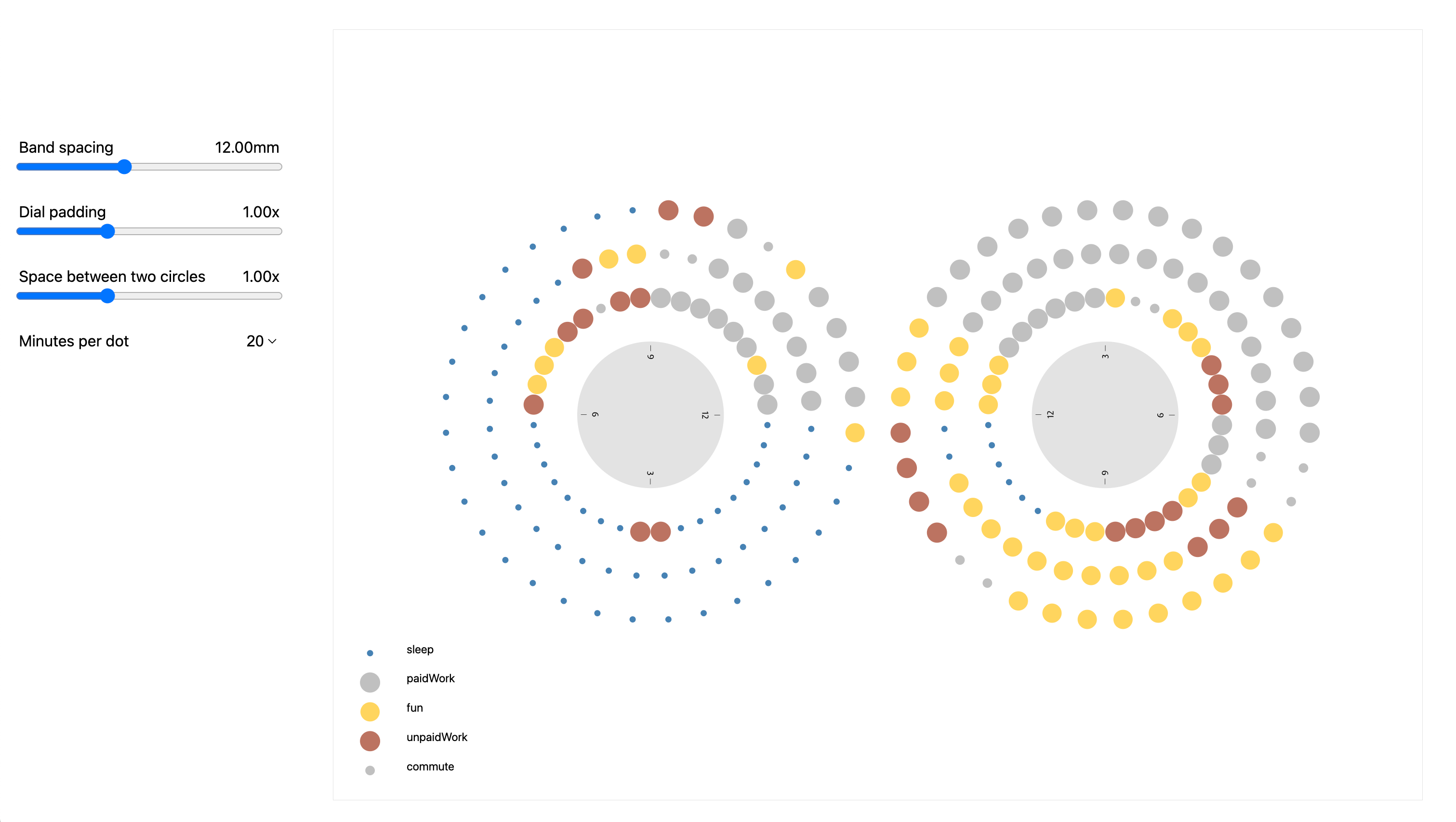
To make sure we didn't have to reglue hundreds of little bits in case we did not like the end result once we were done, I created a digital prototype for the layout. This was a fairly simple Svelte app with barely any styling, but with accurate scale for the watch faces and parts that we wanted to use. I then created a few sliders so we had an easy way of trying out different spacing options.
Once we had this tool, we figured out the best layout fairly quickly, so we simply exported the SVG from the digital prototype and created a simplified template from it. We then printed that on the piece of paper to serve as a guide when gluing the parts on. After that it was just like assembling IKEA furniture: tedious, slightly too long, but fun because we were amongst friends.
Learnings
I think many practicioners who normally work with digital tools and then do something physical and permanent - at least more so than these bits on a piece of silicon - get rejuvenated and learn to appreciate the beauty of irreversible mistakes more. Just like them, we also enjoyed this excursion to physicalization.